As we move into 2019, mobile app design will be a top priority for companies, especially with the rapid pace the smart devices industries are evolving and the high demand for quality products. Which puts the field of UI and UX design firmly into the mainstream, as the secret ingredient of the business/customer relationship.
Less chrome, more content:
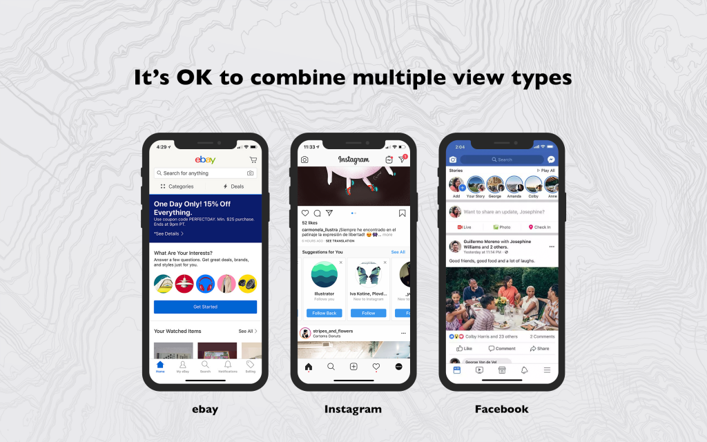
1. Bigger screens = more + bigger + richer content
As phones are getting bigger and bigger these days, mobile app designers are able to double or even triple the content on the screens while following all clean design principles.
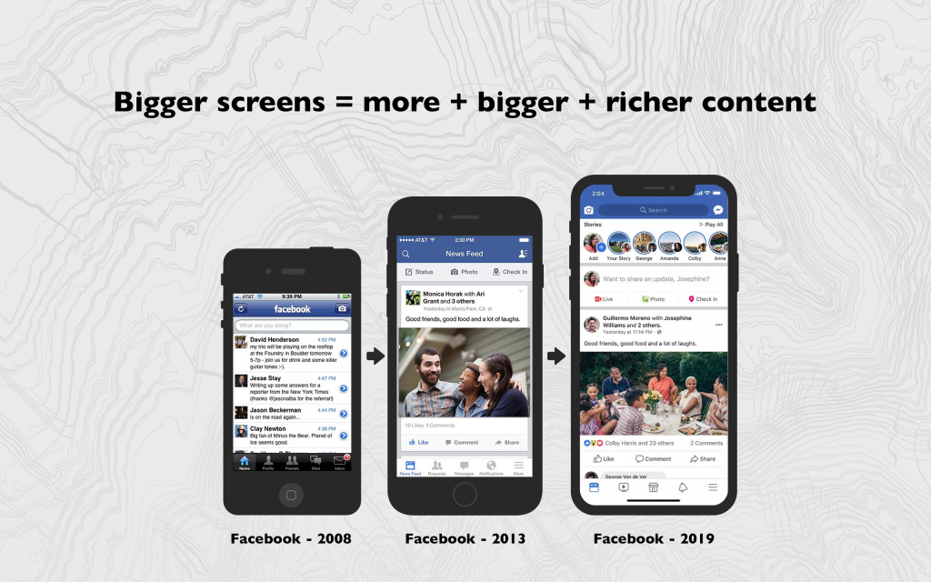
In 2019, combining multiple view types in one screen is the way to go, in order to avoid clutter. Designers now have infinite ways to structure and organize the content by using shortcuts, stories, photo carousels, etc.
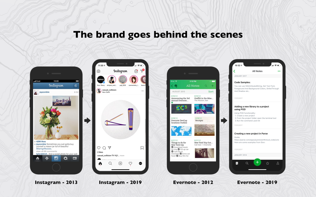
2. The brand goes behind the scenes
Brands like Instagram, Evernote, Spotify, Medium, Facebook Messenger all went through a similar transformation of gradually getting rid of their branding characteristics like logos and colors, and emphasizing the content more. A good example is Instagram and Evernote UI redesign.
Flat UI 2.0
Since Skeuomorphism, also known as a realism based design which imitated real objects, using shadows, shapes, and details from the physical world, that helped users understand how to use the first touch screens phones, Apple introduced Flat UI in 2013 along with the launch of the iOS 7.
This new style had a futuristic and minimalistic vibe and was much more pleasing to the eye, being stripped down of all 3D elements.
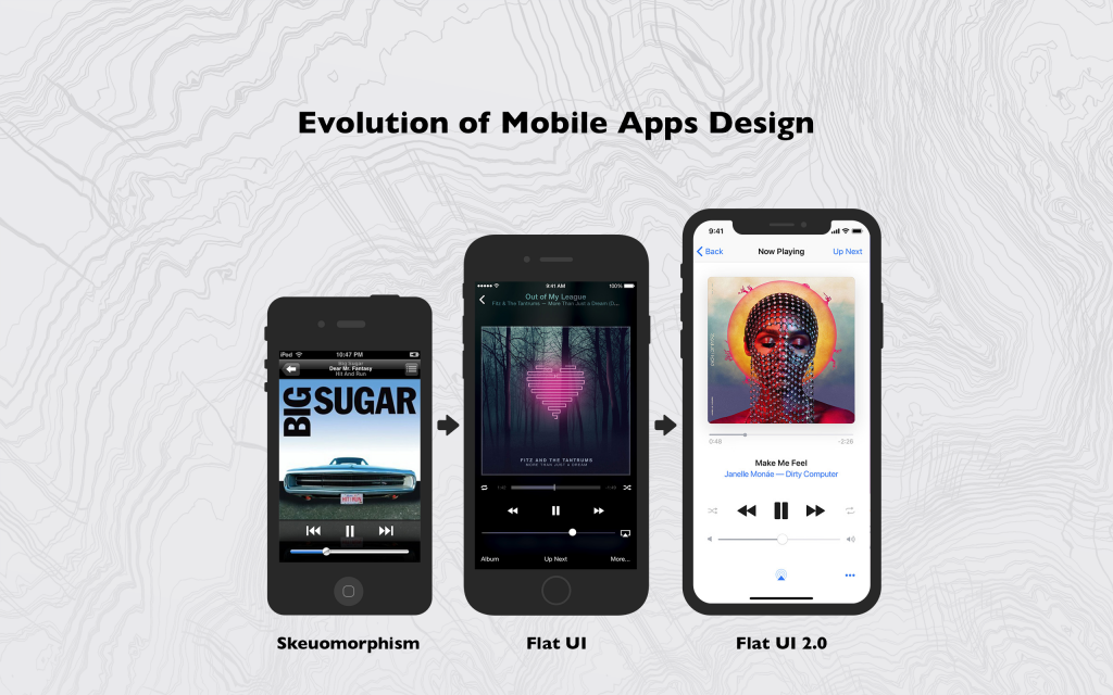
But after 7 years of Fat UI it was time for a change. Flat UI 2.0 was born and tried to address some of Flat UI 1.0 problems by adding metaphors and principles borrowed from Material Design such as shadows and motions, while refreshing monotonic interface with vibrant gradients, bigger fonts, rounded elements, colorful illustrations, and more.
Flat UI 2.0 helps users interpret visual elements and clickable content while making UI more sophisticated.
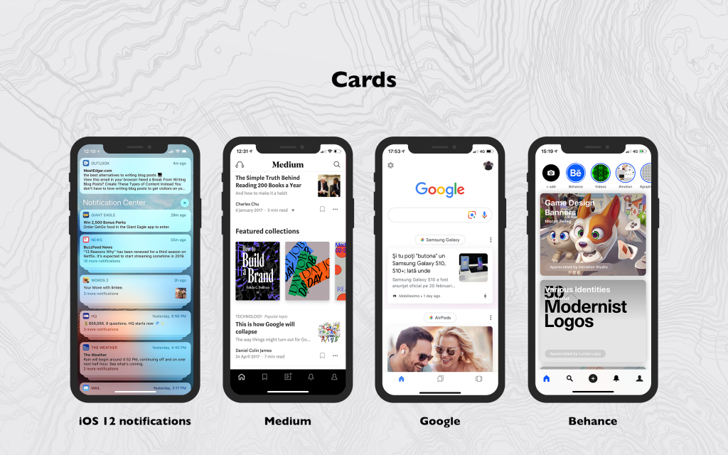
1. Cards
Cards play a crucial role in organizing information and are one of the best ways to avoid clutter. You can group different information types such as photos, icons, buttons, text inside a card to make them look part of one object.
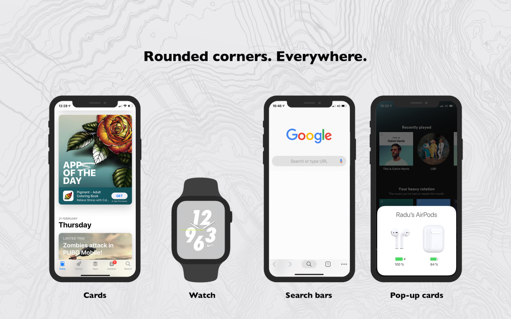
2. Rounded corners
This trend is a result of another trend that came from a hardware perspective. These days all smart devices from iPhones to Android phones to Apple Watches to iPads all have something in common – rounded corners. When every device has rounded corners, it’s only natural that the UI will get the same look and feel.
From rounded cards on iOS notifications to Google’s Search bar, all apps started using rounded corners more frequently. If you want to give your app an up-to-date look & feel, rounded elements are the way to go.
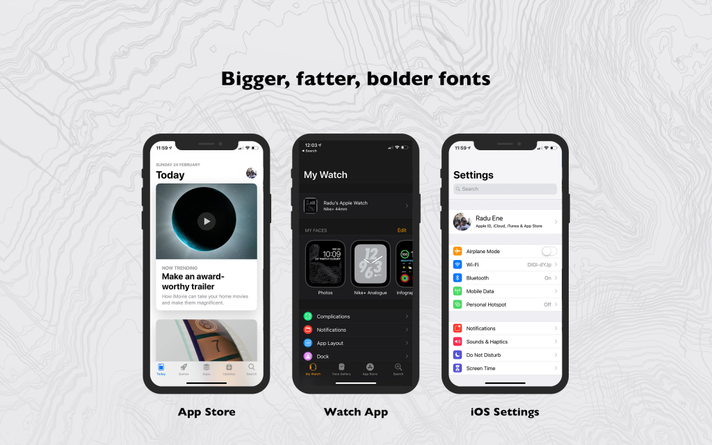
3. Bigger, fatter, bolder fonts
Bigger and bolder headers were introduced in iOS 11 and now widely spread in iOS 12, replacing the extra thin font that was used before. This is a great way to separate content, just make sure not to use bold fonts in normal text blocks, only for titles.
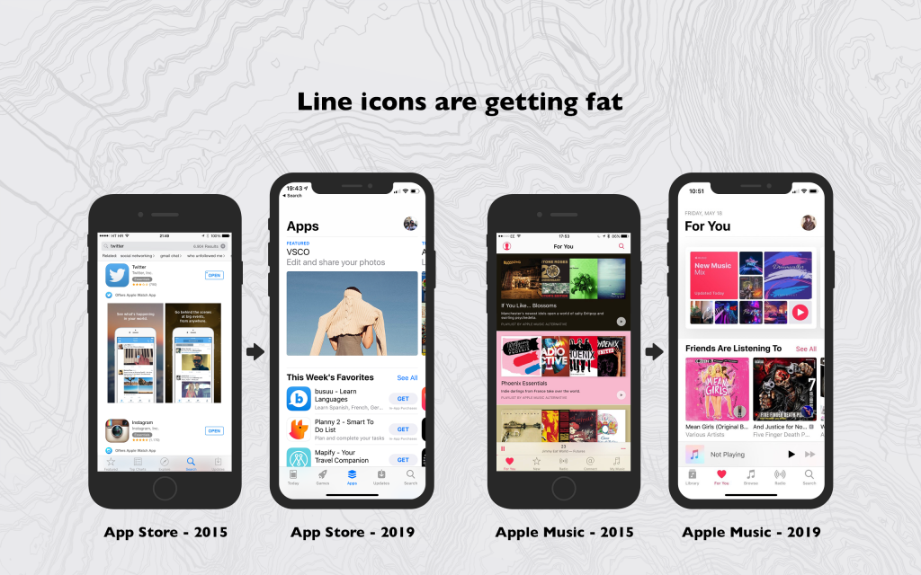
4. Line icons are dead
If you are looking to update your apps icons, checkout this trend. The old thin, line icons are now slowly getting a little bit fatter, still retaining a clean flat look and being minimalist.
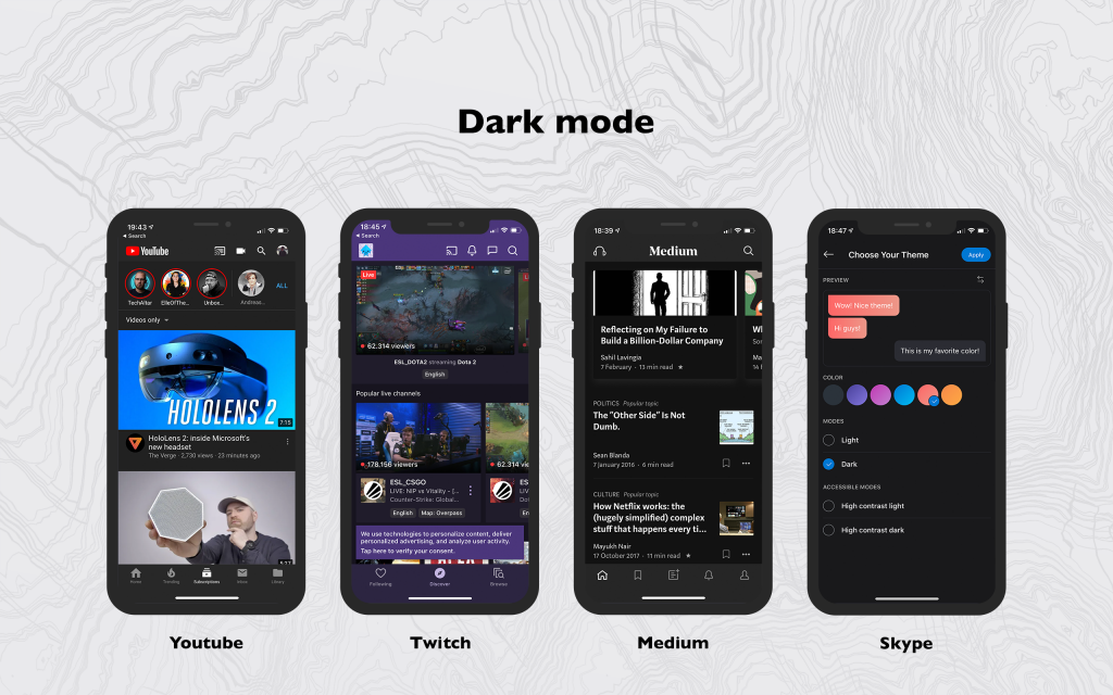
5. Dark Mode
There’s a new trend in app and software design called Dark Mode. If you haven’t seen it hit your phone or computer screen yet, the basic twist is that it swaps in a black-dominant theme for the traditional white and bright colors that have been the backdrop for most app layouts since the beginning of app layouts.
Initial it was used in reading apps but know is adopted by almost every type of app from video content apps like Youtube, to streaming apps like Twitch, chats like Skype or Messenger.
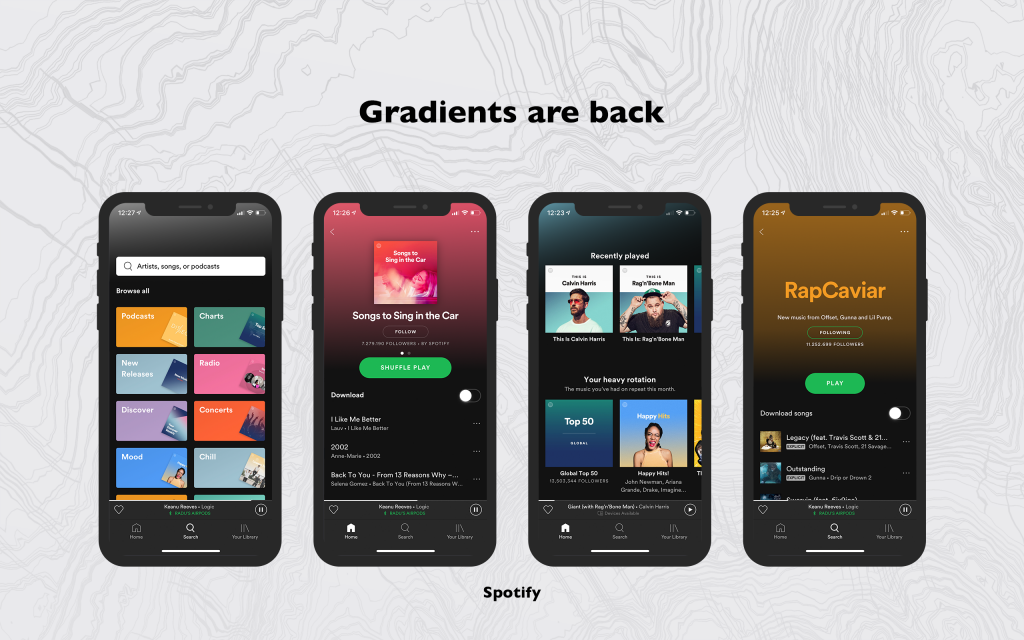
6. Gradients 2.0
Flat colors are out and gradients are back in, and they are more refined than ever before. The new gradients – also called gradients 2.0, are bright and consist of multiple vibrant colors that create a much more pleasant effect than flat colors.
If you’re looking to refresh your app UI, gradients are a great way to do it but pay attention to the colors you pick and beware of the unwanted 3D effect. You don’t want your app to have a Skeuomorphism style in 2019.
Navigation 2.0
Navigation 2.0 mostly emerged as a result of another hardware trend, also known as going bezel-less trend.
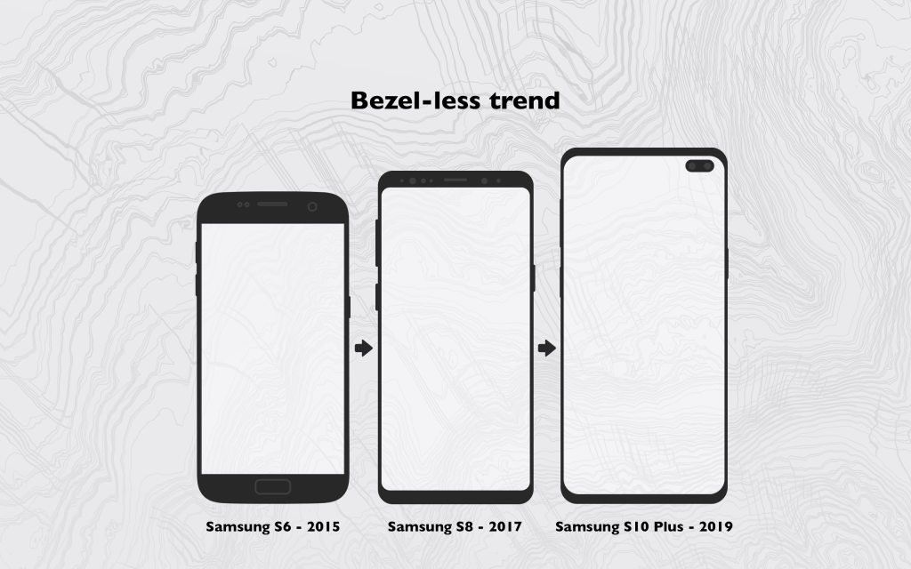
The phablets from 2 or 3 years ago are normal size phones these days, and because of the huge demand of bigger screens, manufactures tried to increase the display size instead of the whole phone proportions.
To achieve this bezel-less look some compromises had to be made, like Samsung and Apple did to their smartphones in 2017 – they killed the home button.
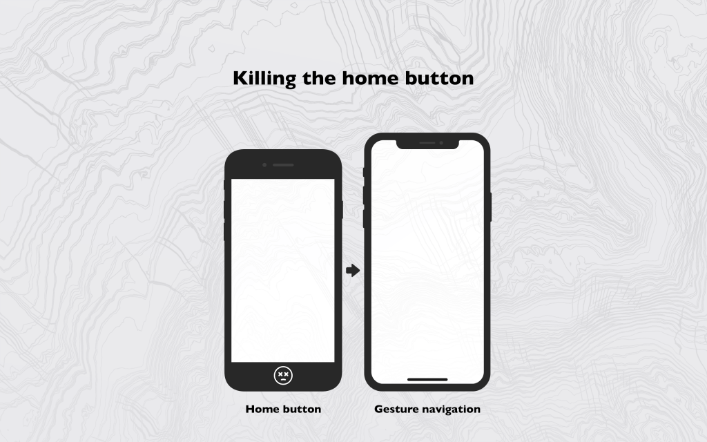
1. Gesture navigation
By removing the home button, gesture navigation was born. Apple with the iPhone X marked the beginning of this trend, and Google with his Pixel 3 just confirmed.
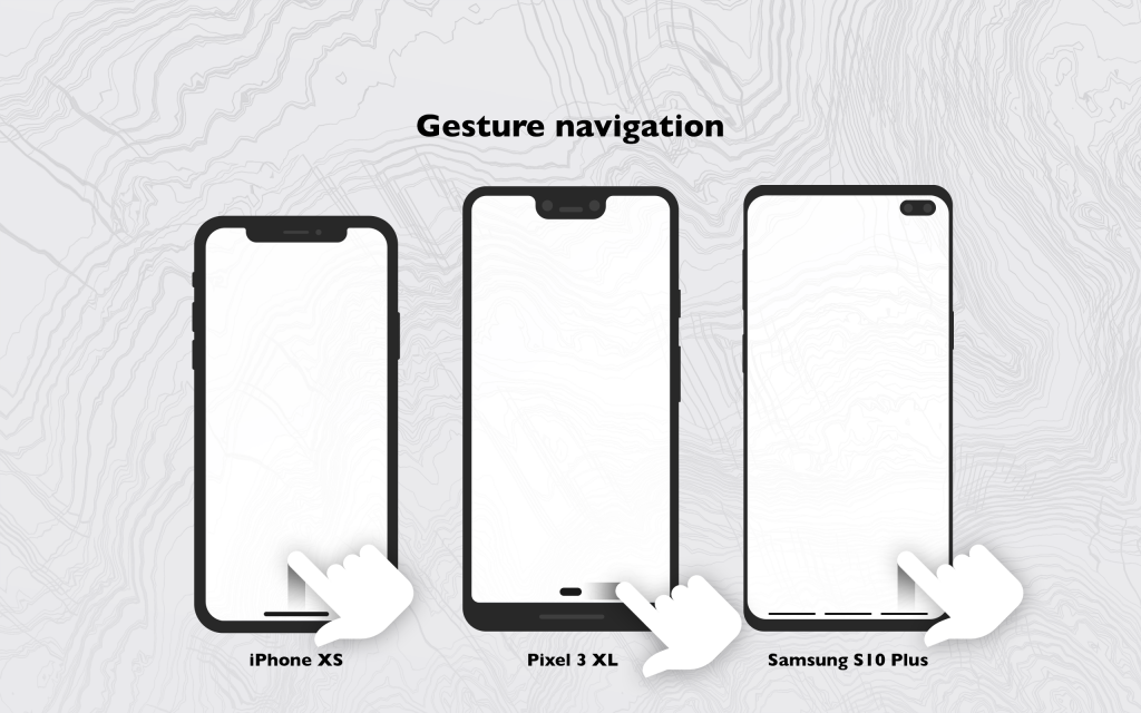
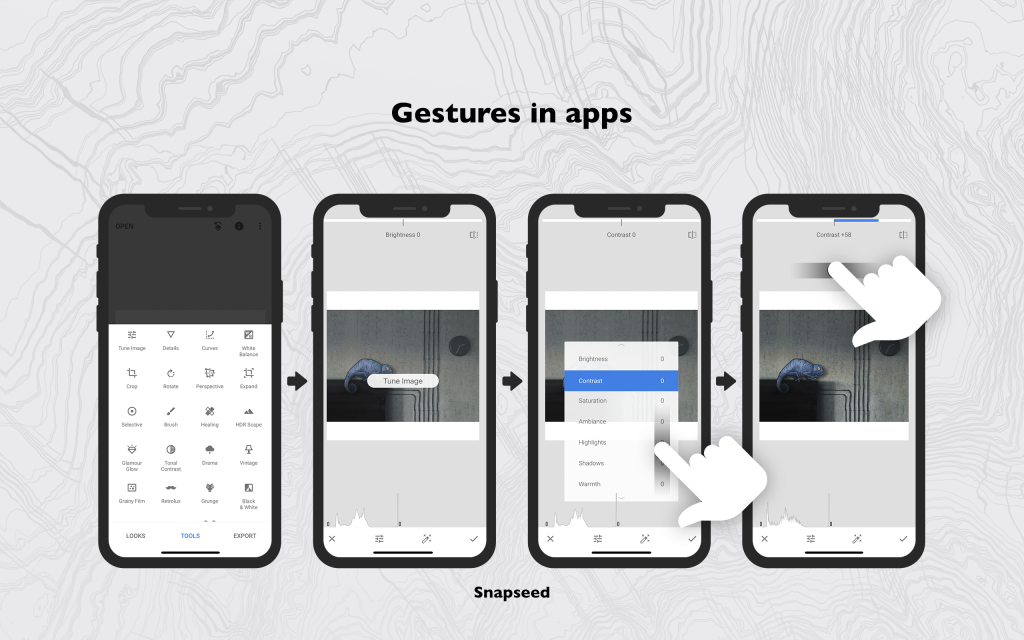
In apps the best example is Google’s photo editing app – Snapseed. To be able to tune your photo you can use gestures by swiping up and down to access the tools and left to right to increase or decrease the effect of one of them.
2. One hand usability
Along with the growth of smartphones we also saw a change in the displays’ aspect ratios.
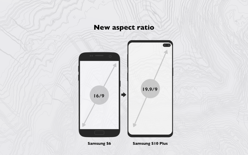
This came with some benefits for the user like being able to fit more content on the screen, improving multitasking, enhancing VR experience and helping with a more comfortable grip on the device.
But it also came with some problems too, like taking away the clickable elements further away from the natural movement of the thumb. The solution is one of Navigation 2.0 biggest trends – One hand usability.
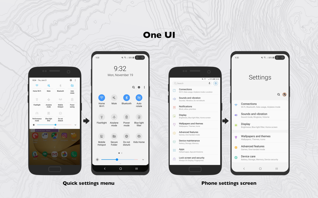
A good example is what Samsung did with its’ new One UI interface. The screen is divided into two parts – the upper part is used for viewing information while the bottom part is used for key interactions such as tabs or buttons.
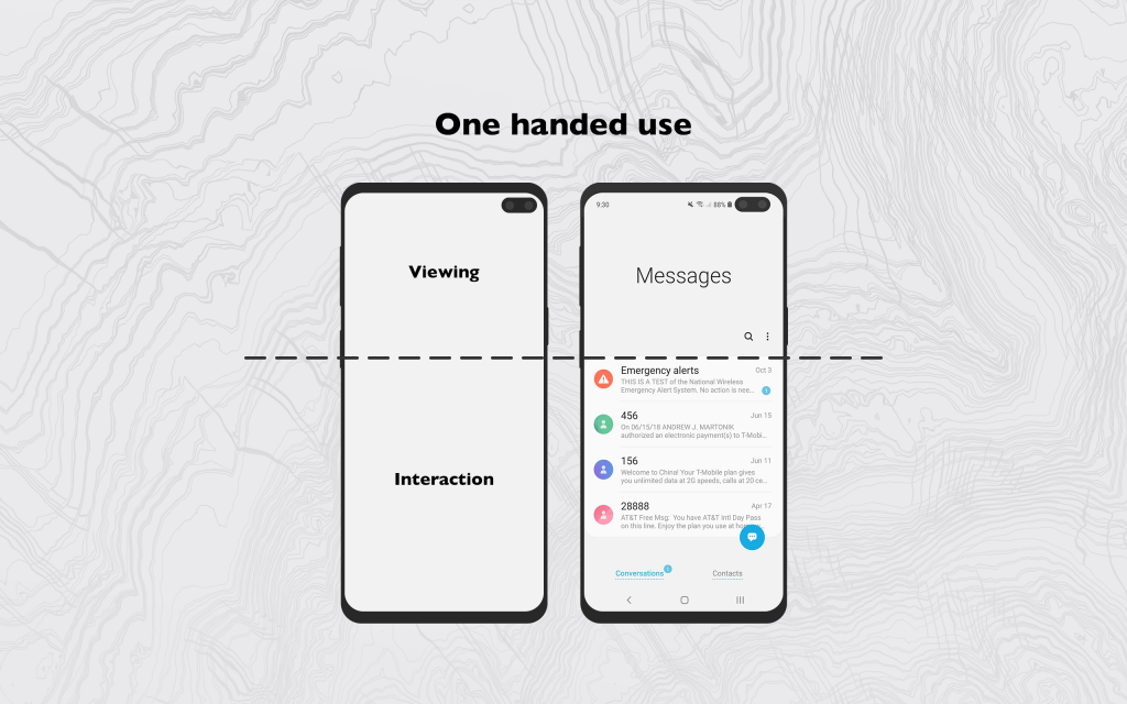
This is a welcomed feature for the UX design approach, because with the age of the BIG screen phones some apps make it really hard to be able to reach the key buttons that are placed on the upper part of the screen with your thumb.
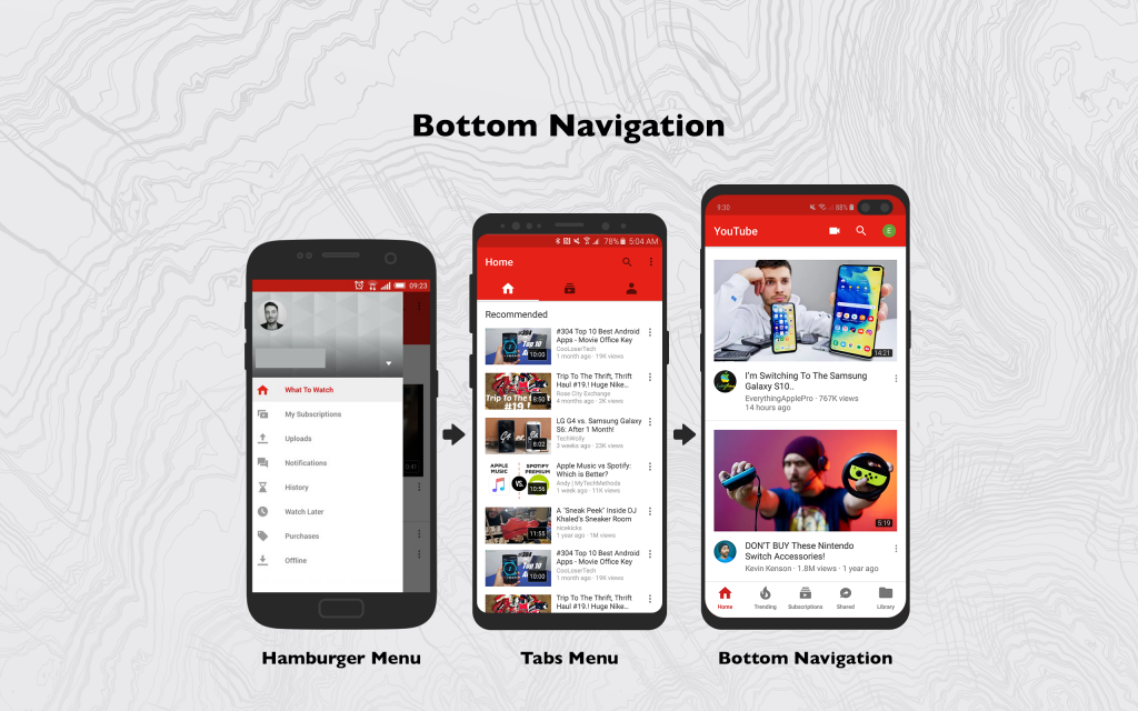
In apps, big companies stopped using the hamburger or tab menus instead of the bottom navigation. A good example is the evolution of the Youtube app in the past years. This practice eventually will become a standard industry practice.
Besides bottom navigation, in 2019 we will encounter a few new features on the mobile app interaction side.
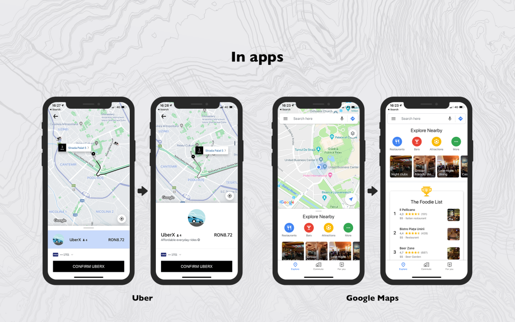
A very good example is Uber and Google Maps. The approached they took up is a little bit off the grid as they introduced a new type of navigation, the so-called “bottom sheets navigation”, which opens up whole new possibilities in interacting and displaying more content on the screen while still retaining the ease of use on a tall aspect ratio display.
3. Simplified authentication
A common problem that almost all users encounter is password management. Despite the struggle of creating an easy to remember password but also difficult for others to guess, and also complying by the recruitment in case it is forgotten, the process of recovering your password is an unwanted struggle.
According to a study, about 40% of people go through this kind of scenario. The way to improve the user experience, in this case, is by finding some way to implement the password-less login method. This can come in the form of biometric authentication (Face ID or Touch ID) for apps that manage very important user information like banking apps or e-commerce apps, temporary passwords that can be received via SMS, or even via a magic link.
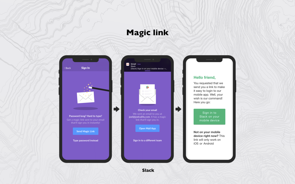
Medium and Slack are amongst the first few who have adopted a password-less login mechanism. Through Slack, if you forgot your password or you’re too lazy to type it in, you can opt for a magic link which will be sent to your inbox. By accessing it, you’re going to be redirected to the app already logged in.
4. Personalized Experiences
The ideology of “one-size-fits-all” is obsolete in 2019. The over-saturated market means that consumers are expecting more from brands. With the rise of machine learning and artificial intelligence, companies now have the chance to take a more personalized approach towards serving their users.
Brands like Spotify, Youtube or Netflix, are known to curate content recommendations with their proprietary algorithm. Expect 2019 to be the year of personalized user experience.
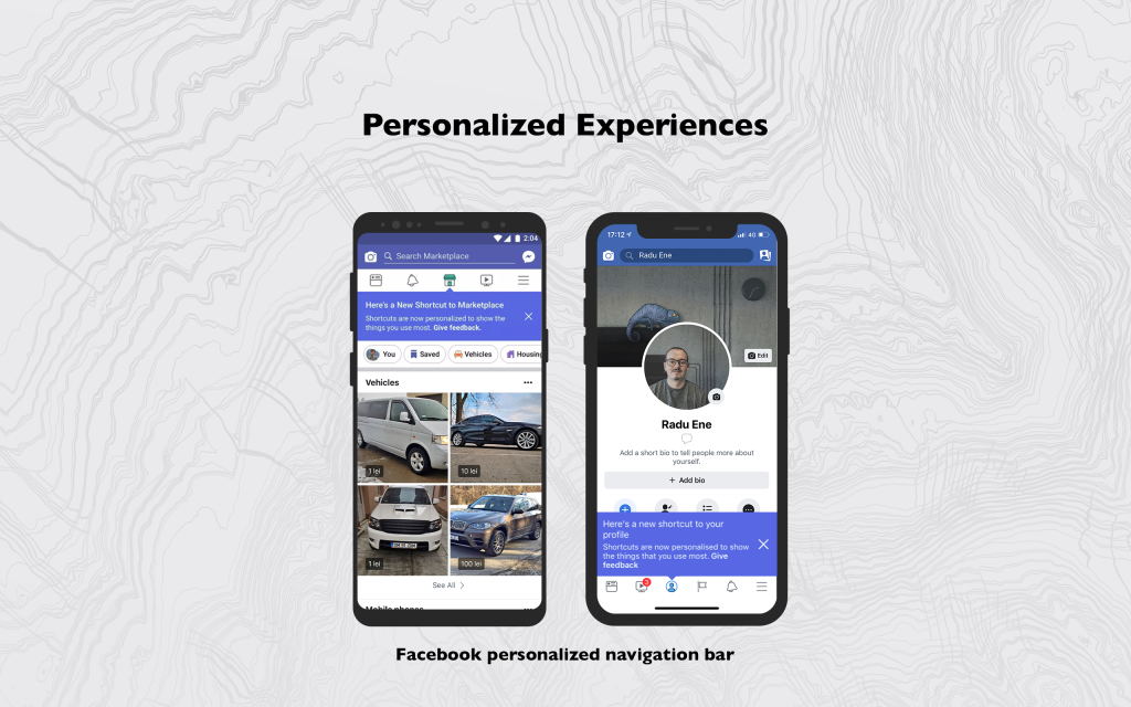
A good example is what Facebook does with the tab menu on Android or the bottom navigation on iOS. The icons on the navigation bar change in order to meet your needs.
For example, if you buy or sell stuff on any marketplace, you will have a dedicated marketplace icon; if you have multiple profile pages, you will have a dedicated profile icon.
Technically, most of these trends aren’t new, but in 2019 we will see them gaining more and more ground. What you’ve probably noticed, is that these mobile trends all have one thing in common, they work toward creating a sleek, fluid, and concise user interface and user experience.